

In 2016 the NEB launched the Data Visualization Initiative to face the challenge of producing usable and useful data to go beyond using new technologies to deliver better service to citizens. It created multiple products from the same information to expand public participation in the energy dialogue and enable evidence-based decision-making. These products include interactive data visualizations and other materials, such as high school lesson plans, as a new way to engage experts and nonexperts.
Innovation Summary
Innovation Overview
The NEB collects, uses, and shares data since its inception. The organization has a long publishing history, yet, despite great public interest on energy and pipeline stories, its reports and data tended to reach a limited expert group. Providing meaningful information to a broad audience of experts and nonexperts requires an innovative approach, especially in an era of instant information.
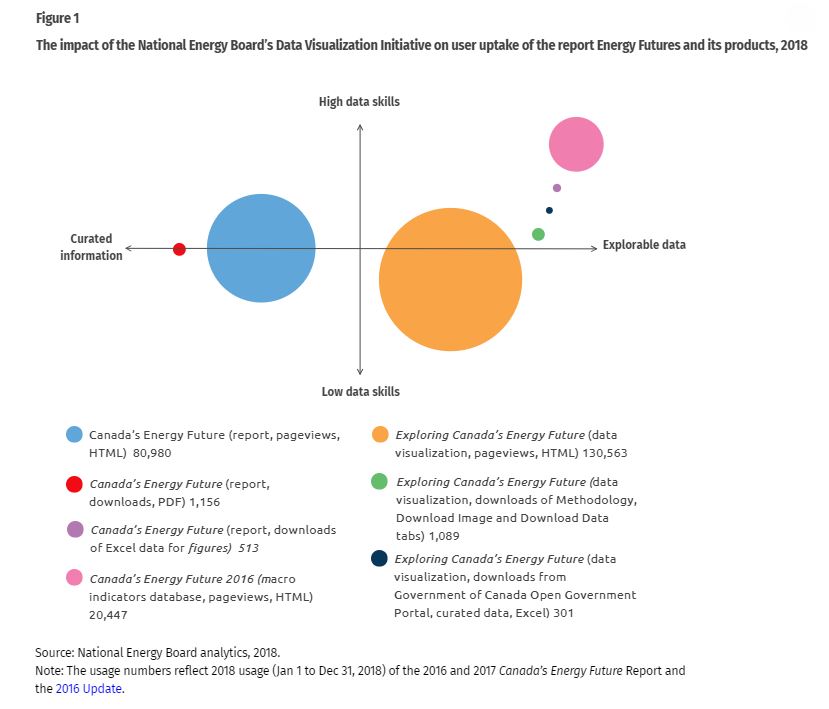
To pilot a new way to share data, the NEB created the Explore Canada’s Energy Future visualization. This was a curated dataset from the NEB’s premier publication Canada’s Energy Future. This publication started in 1967 and evolved with the advance of technology – from paper publication, to mini disks, to downloadable PDF supplement and Excel spreadsheets, to an online publication and database. 2018 usage analytics shows that, in contrast to the 80,000 pageviews the online report commanded, the interactive visualization received 130,000 pageviews.
Figure 1 (section 7.1) plots the Canada’s Energy Future report’s various versions in 2018 against users’ data skills and format preference, based on usage data (we assumed that usage reveals behaviour patterns). We equate the use of the online database with good data skills, and we assume that those who explore the data visualization may be less skilled with data. People who read the report prefer information packaged (curated), and those who explore the data visualization are comfortable with a less scripted experience. It also seems that those who explore the data visualization acquire new skills in the process and download the curated data.
From the numbers of PDF and HTML downloads or pageviews of the report we might conclude that some people prefer to have the context and meaning of the data explained. From the more than 20,000 pageviews of the online appendices (database), we might conclude that there are other users who are highly knowledgeable in the energy and data sectors. But the success of the data visualization shows that giving people tools to explore data and draw their own conclusions has empowered a new group of people to engage in the energy dialogue. That is the essence of data visualization.
Inspired by the success of the pilot, the NEB established a three-year Data Visualization Initiative (DVI),that will wrap up in November 2019. The main objectives were to: (1) facilitate public engagement; (2) increase public confidence; and (3) advance internal operational efficiency. To achieve these objectives, the NEB partnered with a design team from one of Canada’s leading data visualization research labs, the iLab at the University of Calgary, a computer coding startup, Vizworx, and a leading data innovation expert, Annette Hester from TheHesterView. The experience of exploring different datasets and creating interactive visualizations, data warehouses, web services, and coding the analytics to deliver useful metrics that explain how users are navigating through the visualizations is being documented to facilitate future work. So far two other visualizations were created, Pipeline Incidents and Imports & Exports of Energy to and from Canada. Before the end of the DVI, two more visualizations will be published. Note that all the data and source codes for the visualizations are published in the Government of Canada Open Government Portal.
As the DVI unfolded, we anticipated spectacular data visualizations as deliverables, but we also discovered some unexpected side benefits: (1) data discovery leads to clean and structured data by default; (2) subject matter experts change their perspective when they collaborate with designers, coders, data scientists and communicators in a creative process; and (3) people that work with a dataset day in and day out have new insights when they see these datasets differently, such as in a data vizualization. These side benefits turned out to be the most valuable learnings. The NEB is now moving to treat data as an asset; DVI has opened the doors for future mandates and created a new data and information management business unit led by a data scientist as the vice president. In addition to continuing with innovation in visual representation, the new unit ties management, analysis and public release of data and information together.
Innovation Description
What Makes Your Project Innovative?
Establishing fully funded three-year research, coding, and expert contracts to use data visualizations as a vehicle to change an organization data culture is unique and innovative. While many enterprises use data visualizations, the creation of these tools usually happen and the end of the analysis process and most often, they are created by the communications’ teams/business units. In contrast, at the NEB, the lengthiest step is data discovery, which is at the very start of the process. It is this interaction between data scientists, visualization experts, subject area specialists, coders, and graphic designers that reveal the challenges of the datasets and exposes additional applications for this data to the specialists that work with these datasets day-in, day-out. Further, to create visualizations the data needs to be structured. This means that instead of having to impose rules, area specialists organically clean and organize their datasets.
What is the current status of your innovation?
We are currently at the end of the DVI (November 2019). While we are still in the Implementation and Evaluation phases, which for us are a continuous loop, our focus is on the Sustainability of the changes that were introduced to the organization’s business model.
The most significant element for sustainability was the creation of a new unit that combined Data with Information Management and the hiring of a data scientist as the Vice President. Once the new unit was operational, the DVI moved from reporting to the Executive VP for Transparency and Strategic Engagement to the VP Data/IM. From there, in addition to many innovations in data services and digital engagement, the move was to create a strategic plan that delineates the expertise needed to have internal capacity in visual representation to service the enterprise; identify and recruit individuals for these positions; and align the internal processes to ensure they are in place prior to the initiative’s end.
Innovation Development
Collaborations & Partnerships
In addition to the NEB experts, the combination of working with world class university researchers, a startup company, and a leading digital data innovator was key to the success of this initiative. Each one of these individuals and groups made a unique contribution. The design team ensured the process was always at the leading edge of data visualization innovation; the coding team brought the speed of a startup, and the digital data lead provided the glue that kept the group working in unison.
Users, Stakeholders & Beneficiaries
Our user analytics show that we expanded our user base. Hence, our citizens—including civil society organizations and companies—have benefited from having usable and useful data in an open and interactive format. We also made a concerted effort to share our processes, source codes, and learnings with other government(s) departments and in the GoC Open Gov site. Finally, our university partners shared their results in leading data conferences, and will publish in peer-reviewed journals.
Innovation Reflections
Results, Outcomes & Impacts
Our usage analytics data for 2018 show that the most popular format was the data visualization, Exploring Canada’s Energy Future, with slightly over 130,000 page views. In contrast, the online report, Canada’s Energy Future, was viewed 80,000 times for individual sections, and downloaded in full form 1,156 times. The online data appendices, with approximately 20,000 pageviews and 513 Excel downloads, were the next most popular.
Additional significant impacts were the structural changes to the organization, such as changes to main databases, different ways of operating, and even the creation of new units is much harder to capture and evaluate. Ultimately we are looking for sustain changes at the detailed level as well as the fostering of an environment where there is an incentive for innovation, risk, and acceptance of failure. We are in the process of compiling examples and analysis and plan to include them in our final report and methodology.
Challenges and Failures
One challenge was to push the procurement and contracting process to review a proposal that was outside of traditional organizational standards. Throughout the 8-month long contracting process, support from the highest management was key to work through these setbacks effectively.
The second challenge was to convey the need to tolerate a risk of failure, while consuming human and financial resources in the process of building the visualizations. The support base had to be prepared to defend the overall idea.
Finally, it took us a long time to identify that we needed to increase the organization's data literacy at all levels.
Conditions for Success
First and foremost, the most important element for success is visionary leadership that is prepared to support and drive the project through roadblocks. Second, it is essential to have financing for the full length of the initiative. Third, a core group of supporters within the organization are important to facilitate the work of the team. The existence of an internal group ensures the sustainability of the initiative, after external contracts comes to an end.
After that, flexibility and creativity! Balancing the deliverables to ensure they have a wow factor and capture the imagination of the audience. While it is not always possible to have projects that have immediate impact on the daily work of business units, if that is possible, it should be exercised. Finally, ensuring that the work is validated by outsiders is always a positive signal.
Replication
Although it is hard to establish a direct link between the DVI and the increase use of design-focused data visualization in the Government of Canada, many departments cite the NEB visualizations as the gold standard. Many also ask about the use of this tool as an agent of data culture change—and request formal presentations on the subject—however, we are not aware of any department adopting this methodology. It is worth noting that these are early days. We will only be able to evaluate the changing power of this approach a few years from now when we can gage the breadth and depth of the changes.
An unexpected impact has been the interest and usage of these tools by energy and environmental NGOs, academics, and other organizations and multilaterals who are inspired by this example and adopt a new way to incorporate data visualization to their analytics. Last, the design team at the iLab has materials for future papers that will extend the influence of this initiative to new fields.
Lessons Learned
Support from the highest levels of management and a secure adequate budget are an imperative. This commitment to the initiative/project will be noted at all levels of the organization and enable overcoming future resistance. In retrospect, the one element that the leadership did not understand from the start was the issues associate with data governance. For instance, the importance of data ownership—what data was owned, or not, by the organization. Secondly, the project underscored the importance of having data literacy in senior management, to discuss data-related terms such as structured data, artificial intelligence, or data warehouse. In spite of having been commonly used in management decisions, these terms meant different things to different people. In retrospect, we would have started by offering a data science primer to senior management. It would be interesting to hear other people’s experiences with data-related change management, so that the process can be expedited.
Another lesson was the importance of internal communications about the initiative. Perhaps if there are any smaller projects that have a direct impact into the functioning of business units that can be mixed with the larger projects acceptance would be easier.
Ultimately, one needs to be prepared for a certain amount of resistance. That is always the history of innovation. The plus side with data visualizations is that at the end, you have a beautiful product as a deliverable, and one that people use. It is hard to argue when you have the data to show it works.
Status:
- Implementation - making the innovation happen
- Evaluation - understanding whether the innovative initiative has delivered what was needed
Innovation provided by:
Media:
Date Published:
6 May 2019